By Karine Vann
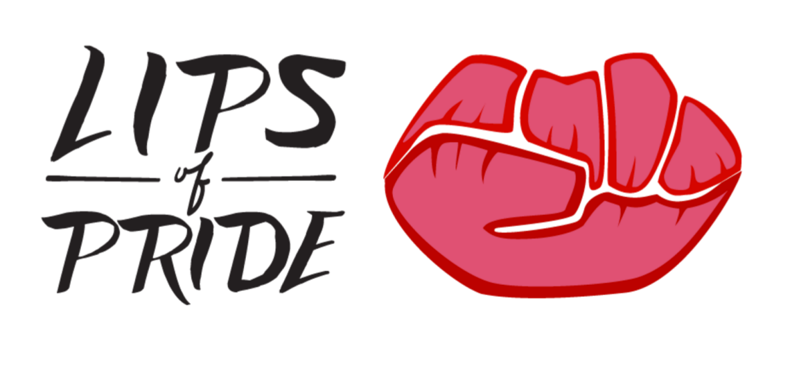
Several months ago, I was approached by HAYP Pop Up Gallery to prepare an icon that would become the symbol for ’s upcoming exhibit, Lips of Pride. When they came to me with the task, there were very minimal criteria: mainly that it incorporate the themes of women’s empowerment and sexuality and that it say Lips of Pride somewhere in the logo.
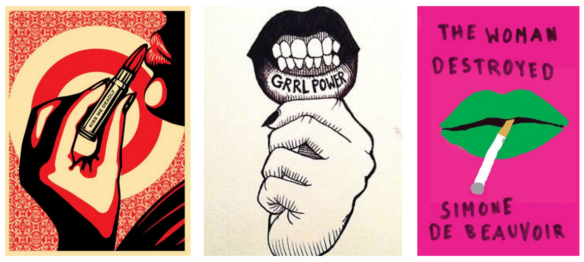
The first thing I set out to do was research posters and designs that communicate all areas that this exhibit touches on: social activism, feminism, the fight for gender equality. I also searched for ways designers in the past have incorporated powerful icons of femininity and female expression.
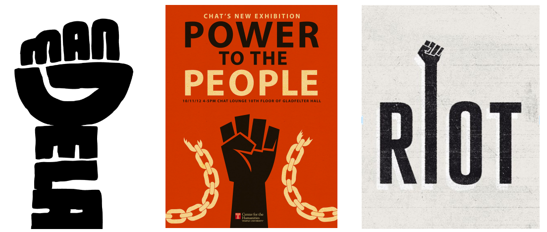
At the heart of my search for visual precedents, I settled on two main themes which stood out amongst the rest. The first reflects the social activism that plays such a large role in this event. For this, the image of the fist, clenched in solidarity, was exceedingly appropriate.
There is a saying in Armenian: Մի բուռ ազգ ենք։
In English, this literally translates to, We are a one-fist nation. It seemed only right, then, that the image of the fist, which so often represents the minority struggle, especially in a small, marginalized country like Armenia, be one of the main themes in this logo.
The second visual theme is a universal symbol of femininity: lips. While some might see lips or lipstick as reductive visual signifiers of womanhood, I see them as a powerful icons of femininity and self-expression. This event is all about speaking up, and what communicates that message more literally than the part of our body where speech actually takes place?

When all is said and done, both images of clenched fists, as well as lips, are clichés. That’s why I wanted to see if I could reinvent both with a new spin. This became especially interesting when I realized that they actually shared some features. It took a few re-workings to get the proportions just right, but after a bit of sketching, I ended up with something I was satisfied with.
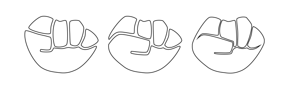
It’s an interesting experiment to present this logo to people and ask which they see first: lips or a fist. I added the interior details in pink because without it, it leaned too heavily on the fist side. Now, I think it’s kind of a tie between the two. I selected a hand-drawn typeface that would highlight the homegrown, grungy vibe of the illustration, and that’s basically it.

Karine jan, your translation of the phrase “մի բուռ ազգ ենք” is not quite right… I would translate it as “we are a handful-size nation”… 😉 (“We are a one-fist nation” –> “մի բռունցք ազգ ենք”…)
But the logo is very creative and came out really well! …though the lips need some Nairian Lip Balm 😀
LikeLike
I love this logo! Beautiful work, Karine!
LikeLike